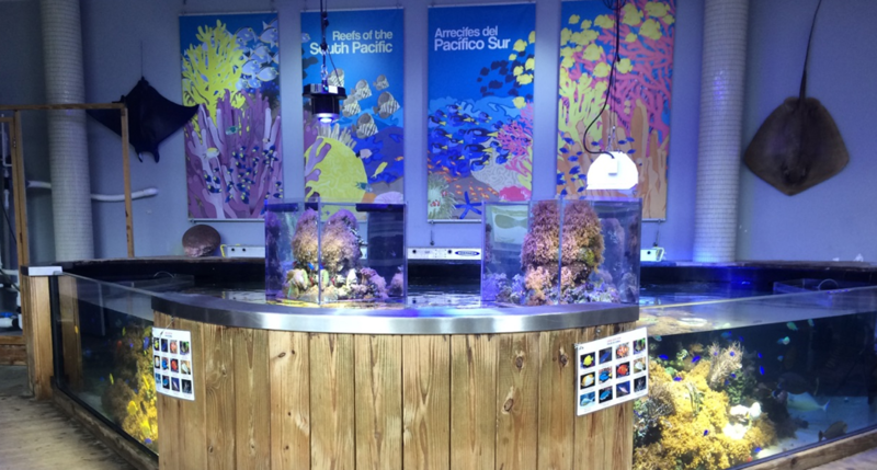
As we move from our now-closed Coconut Grove location to the new Frost Science in downtown Miami’s Museum Park, we want to improve our exhibit experience. To do that, we used the month of August in our old location to test a few new exhibit formats and see how guests responded. To conduct our experiment, we exposed randomly selected Sea Lab visitors of all ages to two prototype exhibit components—fish identification guides and science videos—to see which format of each worked best.
With the fish guides, we presented four types of brightly colored fish guides: placemats attached to tank, placemats loose; four-page fan deck attached to tank and four-page fan deck loose.
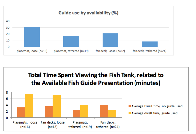
Over nearly 20 hours of observations, we found that visitors clearly preferred to have the fish guide in placemat format and loose rather than tethered. As a bonus, they tended to spend more time viewing the fish when a loose guide was used.
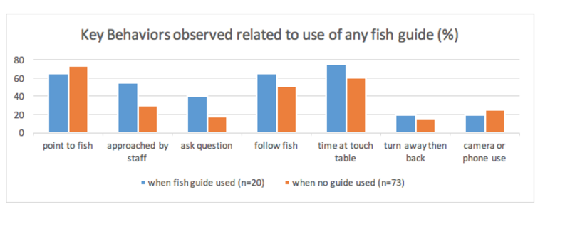
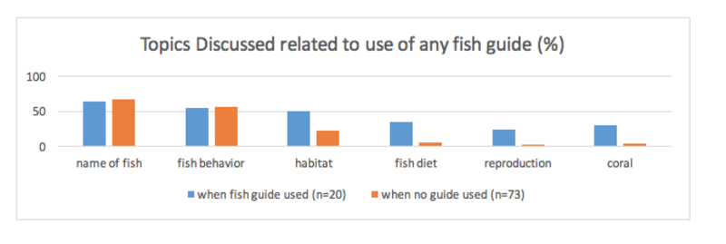
We then compared key behaviors and conversation cues for guests who used any type of fish guide versus those who didn’t. Those who used the guides were more likely to interact with museum staff and they discussed a broader range of topics while spending time near the aquarium.
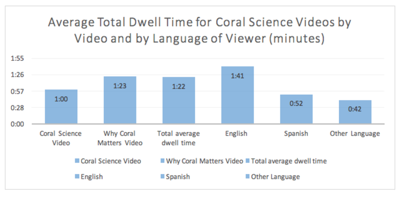
We also tested videos to see how long they should be and if language barriers were a factor. Two, approximately two-minute, videos about coral science and why it matters were available in kiosks within the exhibit space. Each video was started by pushing one of two buttons on the touch screen. English was the spoken language in each video with Spanish subtitles.
Each time one of the videos was started, we noted which video was watched and for how long. Children and adults on average watched a similar length of time. English speaking viewers tended to watch longer than did Spanish or other language viewers.
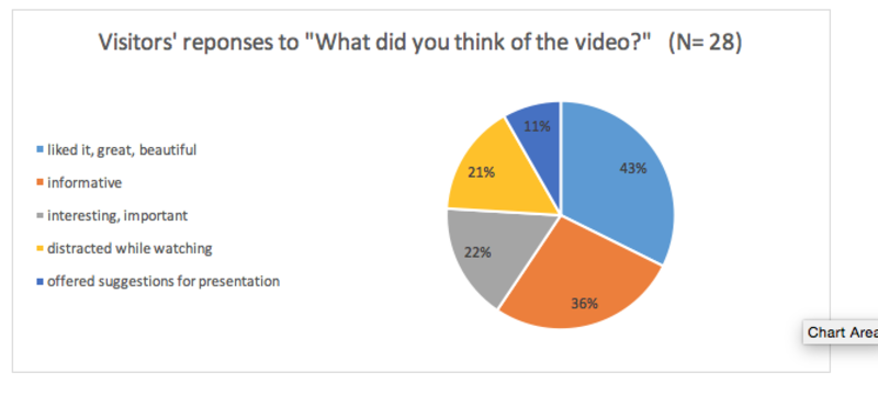
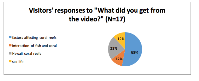
Following the video, we asked visitors what they thought of the video and what they got from the video. Many visitors enjoyed the videos and felt they were informative or interesting. Some people found that with so much else going on around them that they were distracted while watching. With this data it seems that a shorter video with information presented in ways that allow understanding regardless of the viewer’s language will complement the exhibit in a more powerful way for more types of visitors.
When you come visit us at the new Frost Science, be sure to check out how we’ve refined the Sea Lab experience for our new Living Core Aquarium—maybe you’ll see some of the discoveries we made here, or maybe you’ll be part of a new experiment we’re conducting.
Media Galleries
Photos